Not all remakes are created equal
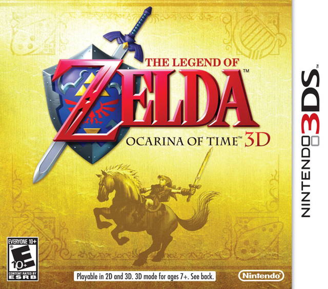
As of late, re-releases and remakes have become a Nintendo staple, often meant to hold fans over until new titles can be released. Although Nintendo has had remakes as early as Super Mario All-Stars on SNES, more people have started to notice with the 3DS and its 3D remakes. The first two were Starfox 64 3D and Ocarina of Time 3D, the latter of which is the focus of this review. By the time OOT 3D was released in 2011, the original N64 release was 12 years old already, and in desperate need of a remake according to most. It's already been a couple years since Ocarina of Time 3D was released so let's determine if the 3D makeover was for the best or not, without all the release hype to contend with.
Regardless of the "3D" tacked onto the name, LOZ Ocarina of Time is still the same old game on the underlying surface. You control Link, the hero of time, who must first journey through Hyrule to find three sacred stones to open the door of time in the temple of time, then after a 7 year time skip, obtain 7 medallions and finally defeat Ganondorf in his castle. It might all be the same for most of this planet's population who has played Ocarina of Time to death, but Nintendo was nice enough to include one additional feature, Master Quest. Originally a 64DD add-on disk that never got made, then a Gamecube game, now you can play harder dungeons in Ocarina of Time 3D, this time with everything mirrored to be even more confusing. It's a good idea, but sad that it took 12 years to finally implement...
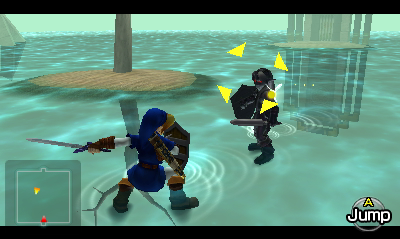
Seeing how this is a remake and not an original game, I will just assume you have some vague idea of the basics of Ocarina of Time. You know, things like the controls, attacks, moves, what the various items are, what sort of amusing characters you'll meet, how to steal the rod, how to unlock swordless link and how many different ways there are to waste your rupees. If all of this just goes over your head, we do happen to have a review of Ocarina of Time, you can find it here.
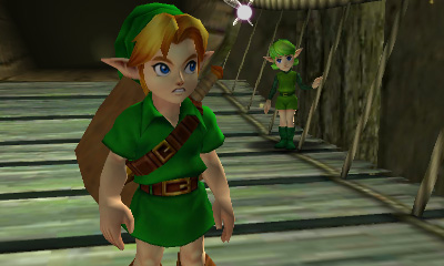
The most notable improvement in this remake is the enhanced visuals. Clearly this was what all the effort went into, as the game runs at a constant 30fps rate and has vastly upgraded visuals. Unfortunately, it turns out most people (and professional reviews even) only seriously commented on the stereoscopic 3D, which is still a bit of a gimmick. Seeing things with added depth is nice and all, but the real value is in the newly drawn graphics. Ocarina of Time 3D is basically what would have happened if Ocarina of Time got a facelift on the Gamecube first. The amount of detail added is quite staggering compared to the quaint and simple looking original. Link's hair actually moves in this version, whereas Link's model and nearly everyone else was rather static. That said, amidst all the extra polygons and vastly expanded textures, I think there's a bit of charm missing. Maybe it's nostalgia or I have bad taste, but Ocarina of Time had a sort of innocence to it. It's like comparing older cartoons to fancy new ones. Sure they may look better, but the old ones had a completely different feeling behind them. A feeling that is really difficult to preserve while improving upon.
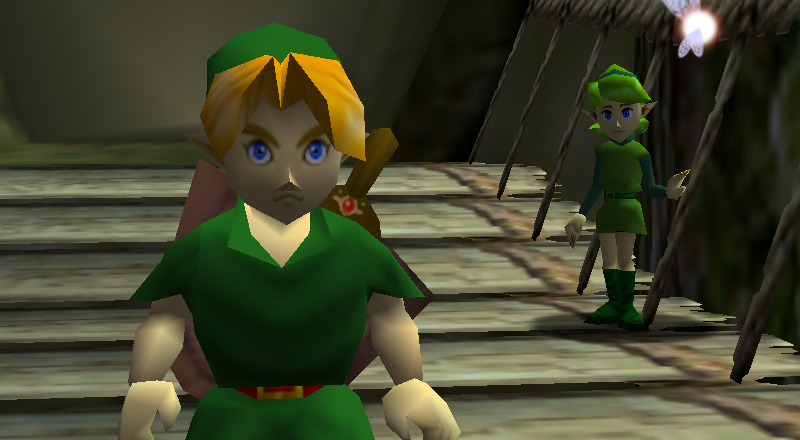
Also of note, the various pre-rendered backgrounds reminiscent of Final Fantasy 7 are gone and replaced with actual polygons. Kind of hard to imagine a 3D game with pre-rendered anything these days, isn't it? By today's standards, Ocarina of Time 3D looks better, though there are some nuisances that tend to detract from the experience. For one thing, certain cutscenes are close but not quite the same as ones in the original game. Some angles have been changed, timing has been altered and sometimes the camera moves when it shouldn't and the other way around. It ends up making the game feel inaccurate, like it was re-created instead of simply ported and updated. Similarly, the game feels very, very different when not running at an average of 20fps. For some people, more frames is better, but games this old have a distinct feel that becomes jarring if tampered with. Ocarina of Time 3D feels wrong in this case, especially when combined with its most significant flaw... The audio.
You would think a remake with such nice visuals would have an appropriately remixed soundtrack, right? Well, you would be wrong. Ocarina of Time 3D, has had literally nothing done to the music, sound effects or voice samples. NOTHING. Not a single thing was updated; it sounds exactly the same as the original N64 version. Not only is this lazy, but it creates an incredibly disjointed feeling game. Everything looks new, but sounds the same as the old version. Granted, there wasn't anything wrong with the N64 version's audio, but if the graphics had to be cleaned up for being too old, why not the audio too? Not updating it makes Ocarina of Time 3D feel like a sloppy half-finished remake. It's not like it would have been a massive undertaking to re-do the music and sound effects, Nintendo has been doing that constantly ever since Super Smash Bros. was a thing. I can't believe this has barely been spoken about since the game's release back in 2011.
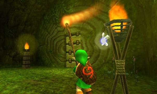
As for how it plays, I have mixed feelings about Ocarina of Time 3D. Thankfully, the engine doesn't feel like it's been changed, outside the additional animation frames from the new graphics, so people who have played the original to death shouldn't have problems here.
What is a problem is the 3DS itself. Due to a lack of buttons, or at least not ones in the right places, Nintendo/Grezzo had to find compromises to fit all the original commands onto the 3DS's limited interface, which makes the game difficult to play if you're used to the N64 controller. Since the 3DS has only 4 face buttons (rather than the N64's 6), some of the inventory buttons had to be moved to the touch screen. You have 4 inventory buttons (unlike 3 in the original), two are the X and Y buttons, two are on the touch screen, and one is dedicated to the Ocarina of Time permanently. The View/Talk to Navi button from the original is also its own touch screen button. So in total, that's 6 inventory related buttons, 4 of which are on the touch screen. Clearly they wanted to make the touch screen not feel like a waste, but they ended up making the game feel less intuitive by cluttering the bottom screen interface up with too many buttons. The extra inventory button on the touch screen wasn't really necessary, other than to make the bottom screen look better by having 4 buttons in each corner. It's also annoying that the physical X and Y buttons are close together while all the virtual ones are spread apart as much as possible. The original Ocarina of Time was far more simple and straight forward than the 3D remake in this case. Maybe I'm just too familiar with the original to adapt, but I would find it hard to believe that there aren't others with the same thoughts on the subject.
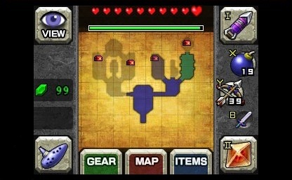
This whole touch screen thing also brings up an issue nobody talks about, having to actually touch the bottom screen with your thumbs. I don't think Nintendo meant for you to hold a stylus while using the circle pad and L button (or the R button and face buttons if you're right handed), so yes, you are supposed to smudge up your 3DS touch screen due to the lack of buttons. That is just bad design to me. I know smart phone users have gotten used to having to look through grease stains on their screens, but that absolutely irritates me to no end, especially since the bottom screen is recessed into the plastic case, making it really difficult to clean around the edges and corners. Even in Super Mario 64 DS, Nintendo used the DS wrist strap to give players a plastic cover for their thumb so they wouldn't have to dirty up their screens. As far as I know, no such option is given for Ocarina of Time 3D.
Not only that, but when using the Ocarina of Time to play a song, Nintendo significantly changed the controls for it. Songs you knew easily before now have to be re-learned. For example, Epona's Song goes C-Up, C-Left then C-Right, everybody knows that. Now it's A, X then Y, which goes in a completely different physical pattern. How hard is it to make the ABXY buttons mimic the C-buttons from the original? Just use the R button in place of the N64 A button or something. Why did they have to change almost the entire interface for everything?!
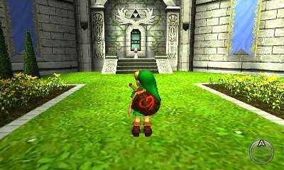
Despite all the issues and inconsistencies, the most positive thing I can say is by and large, Ocarina of Time 3D stays relatively faithful to the source material. I haven't found an area or dungeon that has been changed in error or enemies and items that act differently. The music at least didn't get butchered or mangled during the remaking process. Better to have the music stay the same than for it to be made worse, I suppose. The new graphics are definitely great, technically better than the original. The game's textures all seem to be simply cleaned up and enhanced, not drastically changed. The various characters still look as they should and the translation largely seems the same. It's good that Nintendo felt much of the game wasn't broken and in need of fixing, unlike a lot of companies who do remakes.
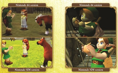
For all intents and purposes, Ocarina of Time 3D is still a good game at its core, a game that's as timeless as when it first hit store shelves. As a remake though, Ocarina of Time 3D fails to impress me. The lack of audio enhancements is a huge problem that ruins the fancy new graphics. It feels half baked and half finished. The graphics themselves are good, but what good is that if the other half of the game was left 12 years in the past? Despite the visual cleanup, the 30fps rate makes the game not feel like Ocarina of Time anymore, which really was defined by its dodgey 20fps limit, for better or worse. The stereoscopic 3D is fine, nothing out of place with it, though if 3D makes your eyes hurt, it won't be a selling feature for you. It also doesn't actually add any real substance to the game though, you can turn off the 3D and not miss out on anything. Ocarina of Time 3D is good for a portable version of the game, but I don't consider it the be all, end all version of Ocarina of Time, perhaps Nintendo will re-release this remake and include enhanced music in the future, maybe on the Nintendo 4DS with the real time clock Ocarina of Time was originally going to have.
Score (Out of 5):   
Written by Aaron Wilcott
August 31 2014
|